shadcn CLI 3.0 and MCP Server Review: The Ultimate Toolkit for Modern Frontend Development
One command line to add UI components to your project
发布时间: 10/5/2025
Product Overview: The Component Foundation
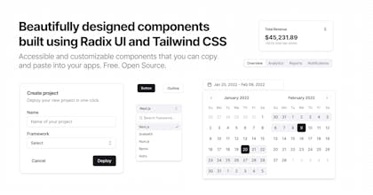
The shadcn CLI 3.0 and MCP Server update is a significant evolution of the wildly popular shadcn/ui component library, positioning it as the ultimate foundation for building modern, customized design systems. Unlike traditional component libraries that are installed as a single package, shadcn/ui provides a curated set of beautifully designed, accessible components that are added directly to your project's codebase using the new shadcn CLI. This approach gives developers full control over the code.
The core value proposition of shadcn/ui is developer experience meets complete customization. It's built on utility-first CSS frameworks (like Tailwind CSS) and React/Next.js best practices, making it a perfect fit for developers and teams who prioritize a headless, un-opinionated foundation. The target audience is primarily frontend developers, full-stack engineers, and design-minded founders looking to accelerate development without sacrificing design quality or code ownership.
Problem & Solution: Ownership Over Abstraction
What Problem Does It Solve?
Traditional component libraries, while offering speed, often present a trade-off: you get a pre-styled, pre-configured component that is fast to implement but difficult to deeply customize or extend. When an app scales, developers often find themselves fighting the library's abstraction layer to achieve a specific design or interaction. Furthermore, a single bug in a library update can break your entire application because the components are locked away inside the node_modules folder.
The shadcn Solution
shadcn CLI 3.0 fundamentally changes this paradigm. It acts as a sophisticated code generator, fetching and injecting the raw component code—including React, TypeScript, and styling logic—directly into your project's components folder. This means you own the code from day one. You can rename props, alter markup, tweak utility classes, or integrate complex state management without needing to eject from a library's framework. The introduction of the MCP Server further streamlines this process, likely improving the efficiency and reliability of component delivery and updates. This "copy-paste" approach fills a critical market gap by offering the speed of a component library with the flexibility of a bespoke design system.
Key Features & Highlights
The updates to the shadcn CLI and the underlying infrastructure solidify its position as a leading choice for component development.
- One-Command Setup: The process of initializing and adding components is incredibly smooth, starting with a simple
npx shadcn@latest init. The CLI handles configuration, ensuring components integrate seamlessly with your existing React/Next.js, TypeScript, and Tailwind CSS setup. - Full Code Ownership (The USP): This is the biggest selling point. Components are copied into your project, meaning no
node_moduleslock-in. This enables effortless theming, detailed code auditing, and performance optimization entirely on your terms. - Seamless Integration with v0 by Vercel: The maker specifically notes the ability to "play and mix with v0 by Vercel." This indicates a forward-looking compatibility, allowing developers to generate new, AI-powered components via v0 and easily integrate them into their shadcn/ui-based design system, marrying code ownership with AI-assisted component generation.
- High-Quality, Accessible Components: Every component is meticulously crafted for aesthetics and accessibility, often following ARIA best practices. Developers start with a professional-grade foundation that reduces the boilerplate of building accessible UIs from scratch.
- Open-Source and Community Driven (Hacktoberfest Ready): The project is fully open-source, aligning perfectly with community initiatives like Hacktoberfest. This ensures rapid iteration, broad community support, and transparent development.
Potential Drawbacks & Areas for Improvement
While the shadcn approach is transformative, it is not without its trade-offs, which potential users should consider.
- Manual Updates: Since the code is copied, components do not automatically update when shadcn/ui releases a new version. Developers must manually track changes and decide whether to re-fetch and overwrite their customized component code. This trade-off is the price of full control. An area for improvement would be an advanced CLI command that highlights changes in a component file before merging, making updates less destructive.
- Increased Codebase Size: Directly integrating all component code will naturally increase the size of the project's codebase compared to installing a single package. For very small projects where ultimate control isn't necessary, this might feel like overhead.
- Dependency on External Libraries: shadcn/ui relies heavily on primitives from libraries like Radix UI for logic and Tailwind CSS for styling. While these are industry standards, the developer must be comfortable working within this ecosystem. A clearer mechanism for swapping out or migrating underlying primitives (e.g., from Radix to a native implementation) could add even greater future-proofing.
Bottom Line & Recommendation
The shadcn CLI 3.0 and MCP Server is a must-try for any modern frontend development team.
This is not just another component library; it's a powerful toolset for component engineering. If your team builds custom design systems, prioritizes deep code customization, or requires complete ownership over every line of frontend code, shadcn/ui is the superior choice. The continuous improvements, the full code ownership model, and the seamless integration with cutting-edge tools like v0 make it a foundational asset for high-quality, scalable web applications. If you’re building a long-term product and want an escape from the "library lock-in," dive into the shadcn CLI today.
Featured AI Applications
Discover powerful tools to enhance your productivity
MindMax
与AI互动的新方式
超越 AI 聊天,将对话转化为无限画布。结合头脑风暴、思维导图、批判性与创造性思维工具,帮助你可视化想法、高效解决问题、加速学习。
AI Slides
AI 驱动幻灯片,Markdown 魔法加持
革命性幻灯片创作,融合 AI 智能与 Markdown 灵活性 - 随处编辑,随时优化,轻松迭代。让每个想法,都能快速变成专业演示。
AI Markdown Editor
打开即写 - AI驱动的Markdown编辑器
极其高效的写作体验:AI助手、斜杠命令、极简界面。打开即用,轻松写作。✍️ Markdown简洁 + 🤖 AI强大 + ⚡ 斜杠命令 = 完美写作体验
FunBlocks AI Extension
🚀 AI驱动的浏览器扩展
用FunBlocks AI助手改变您的浏览体验。您的智能伴侣,为网络上的AI驱动阅读、写作、头脑风暴和批判性思维提供支持。